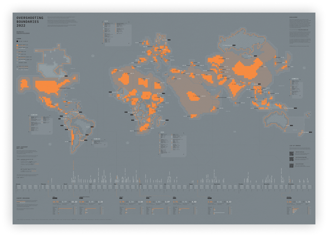
Overshooting Boundaries
2022
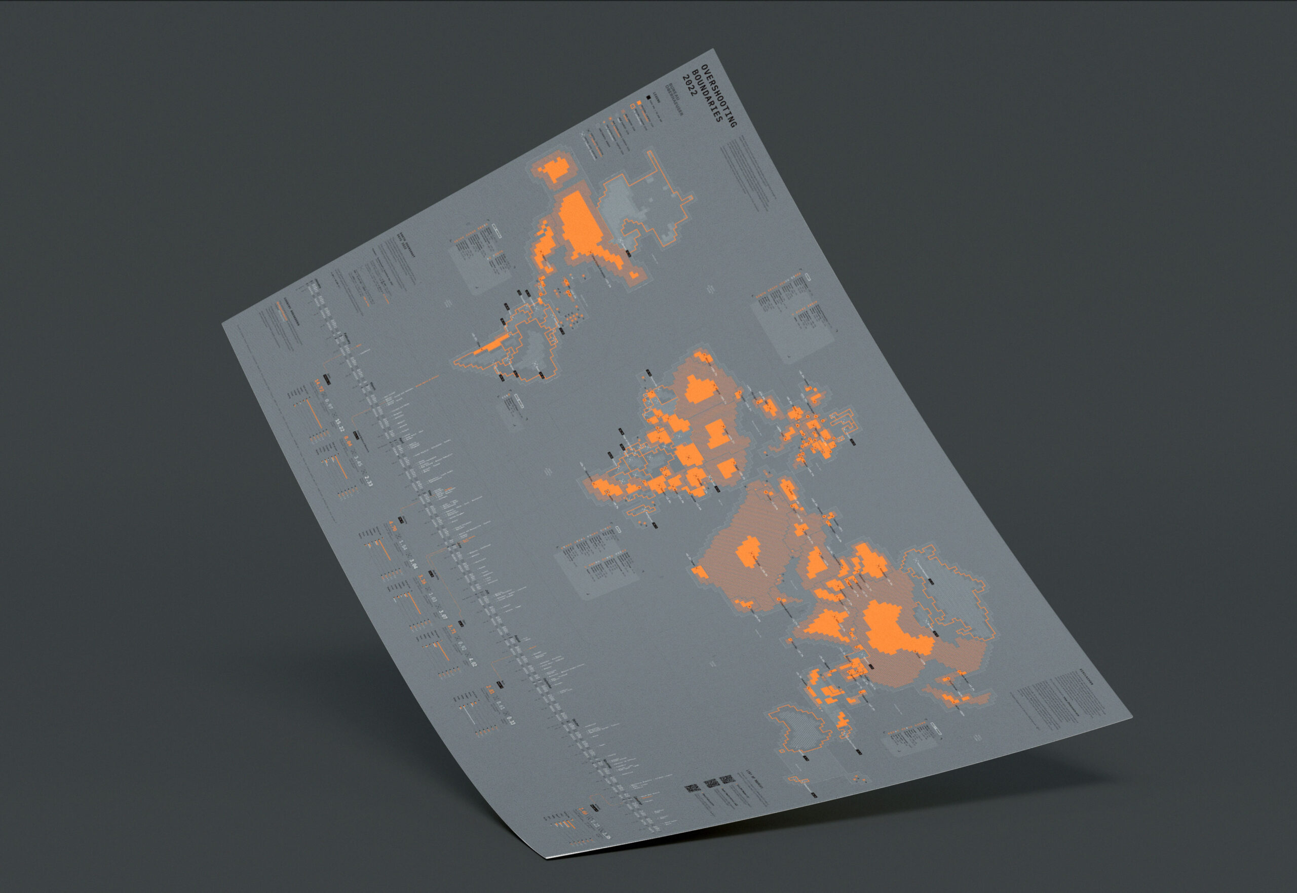
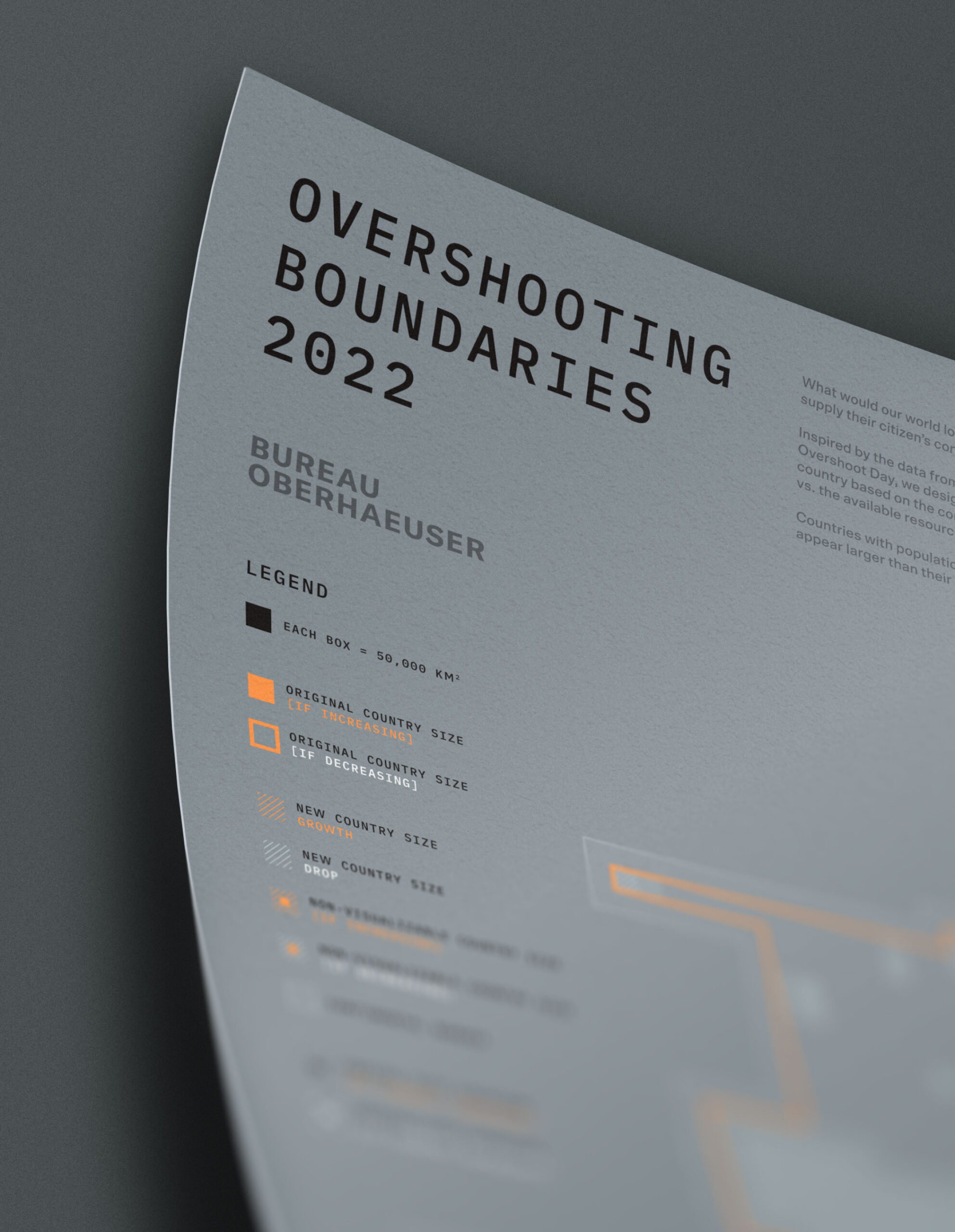
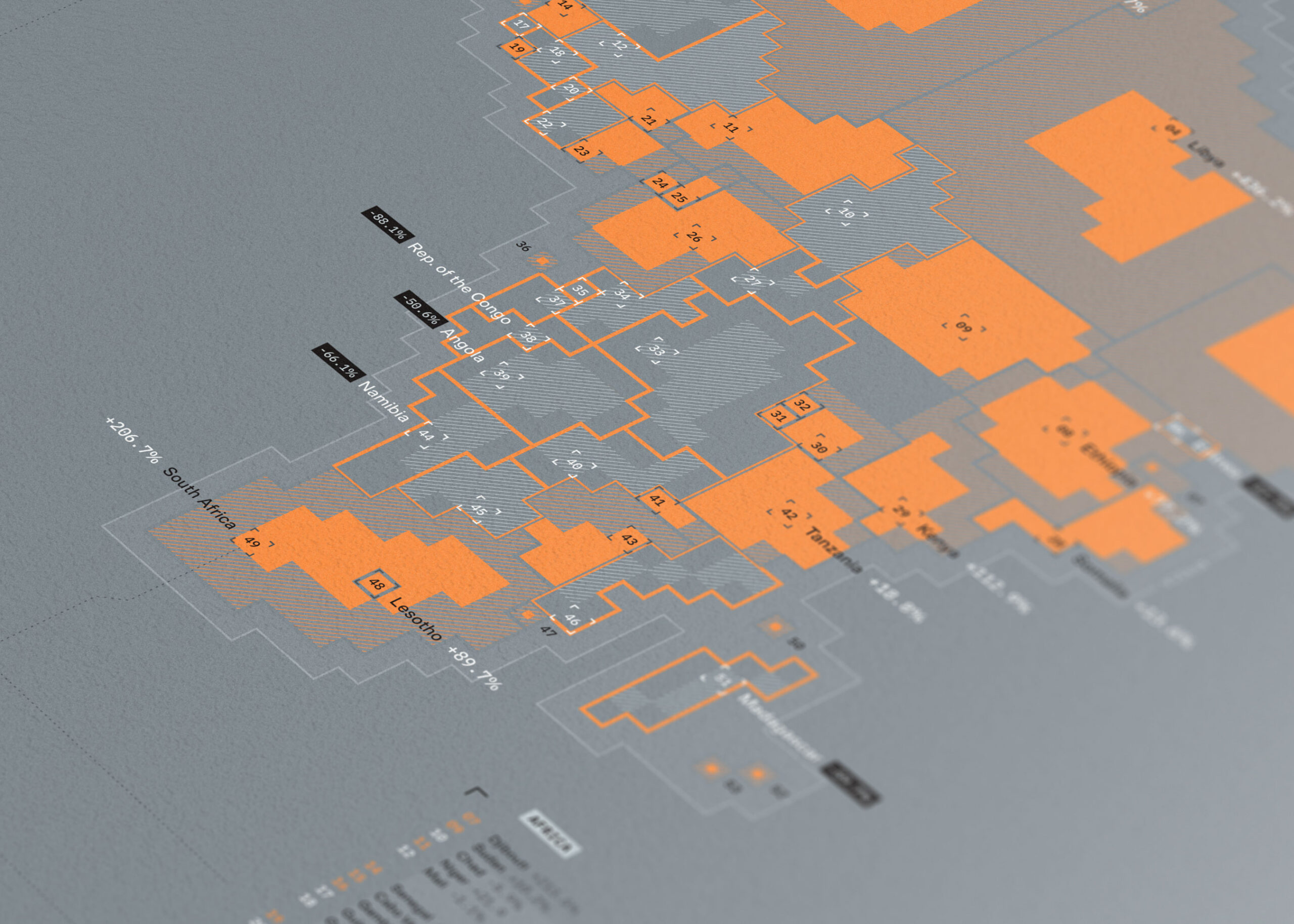
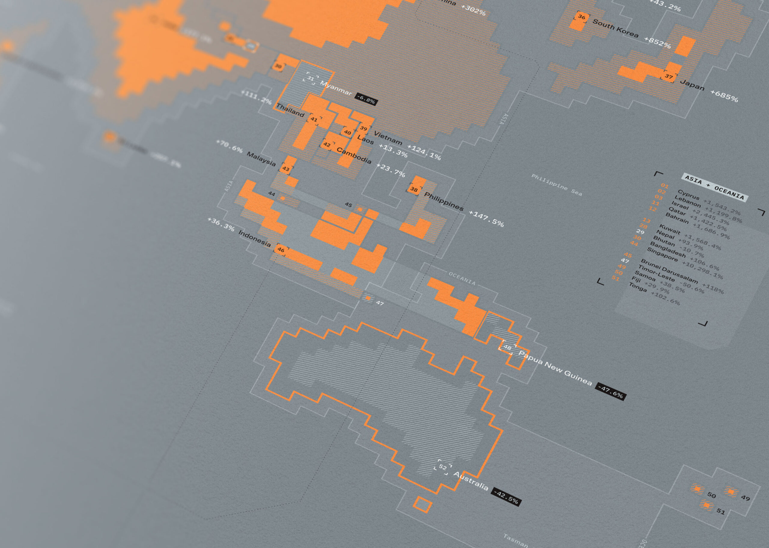
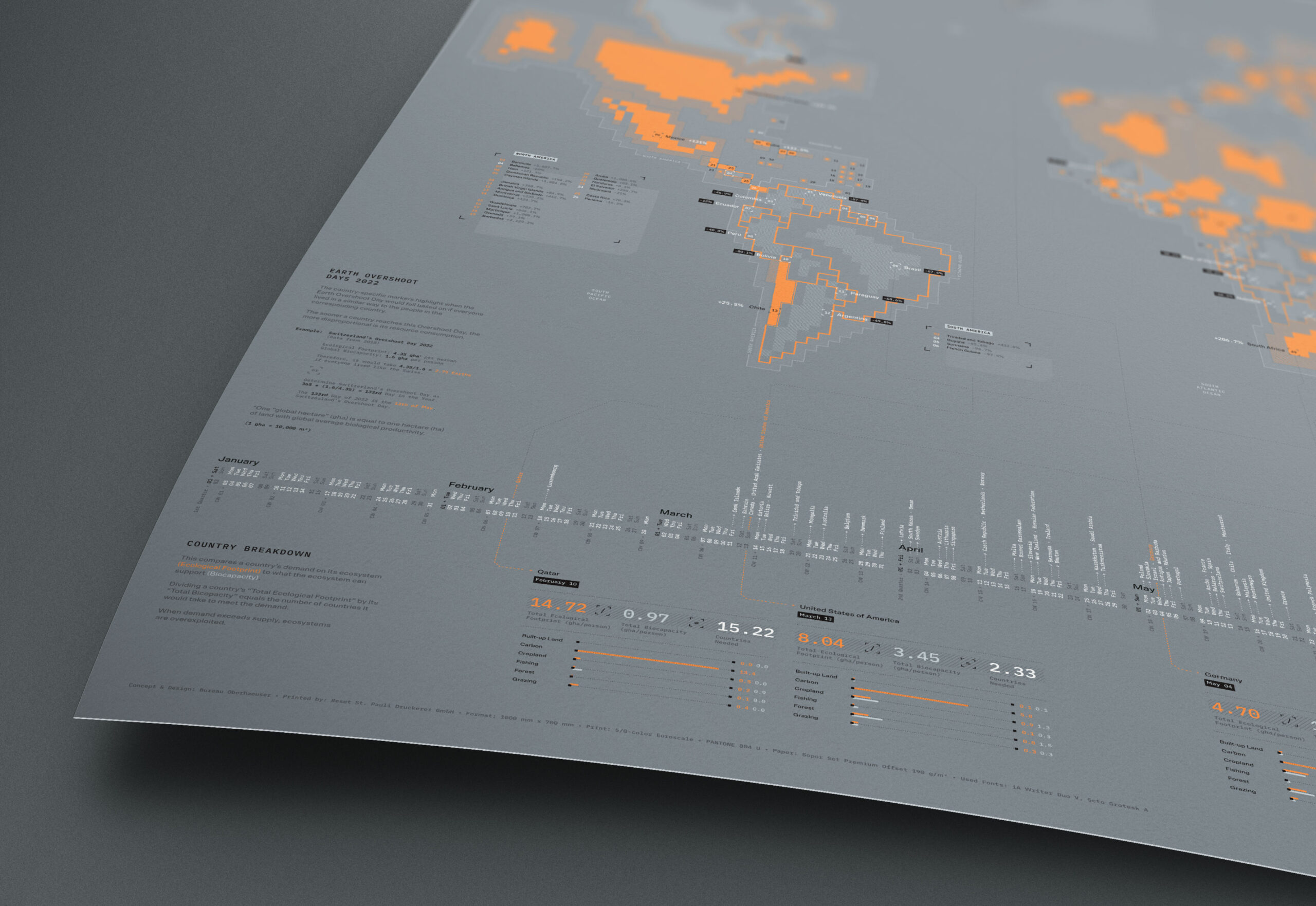
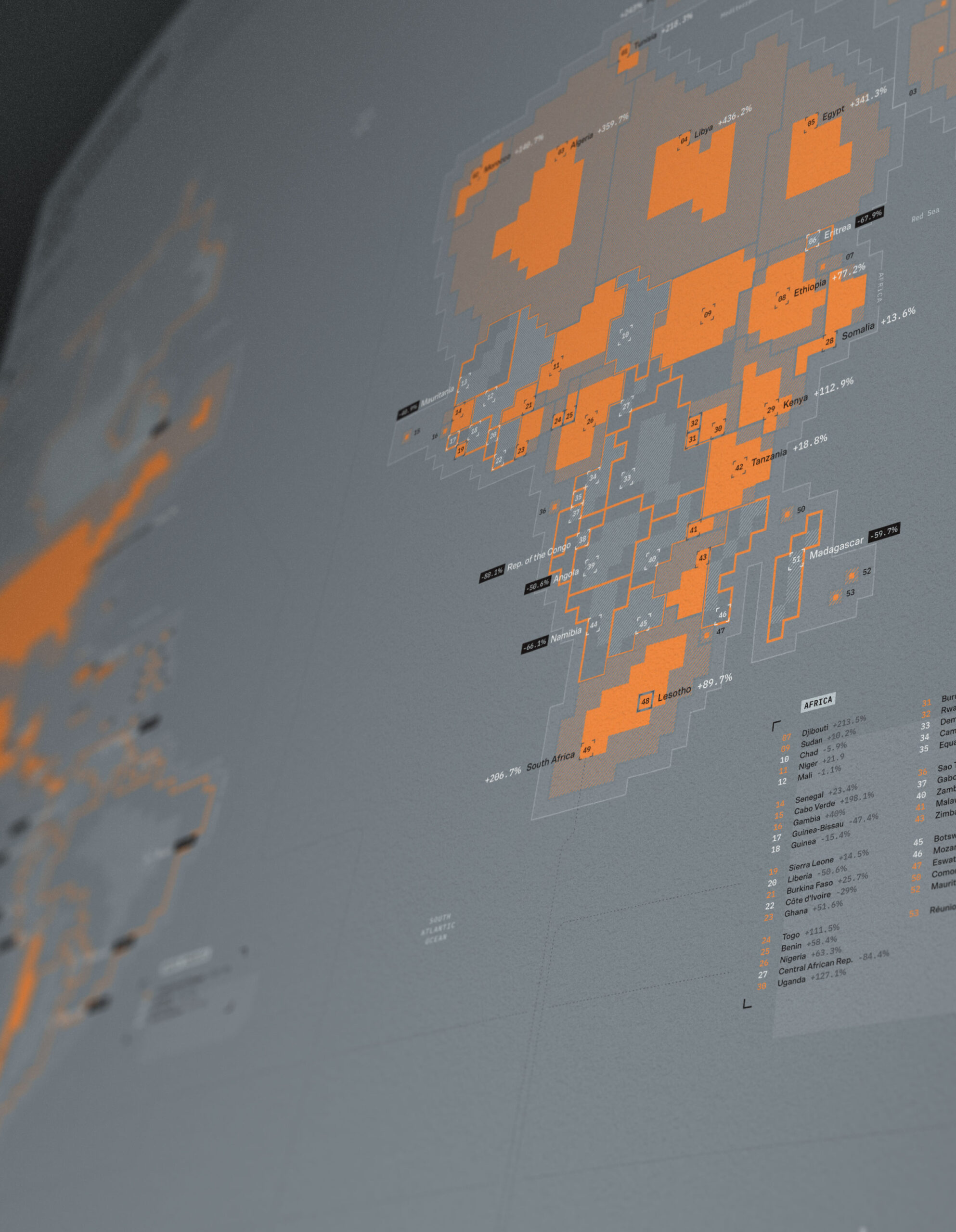
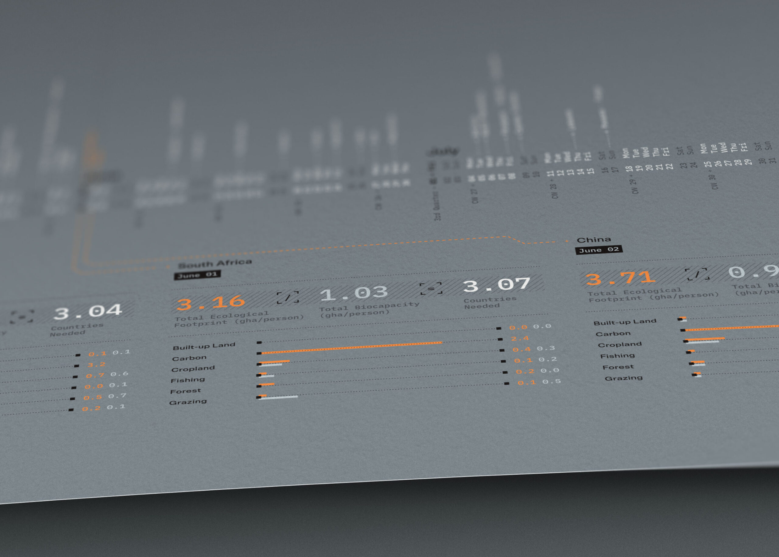
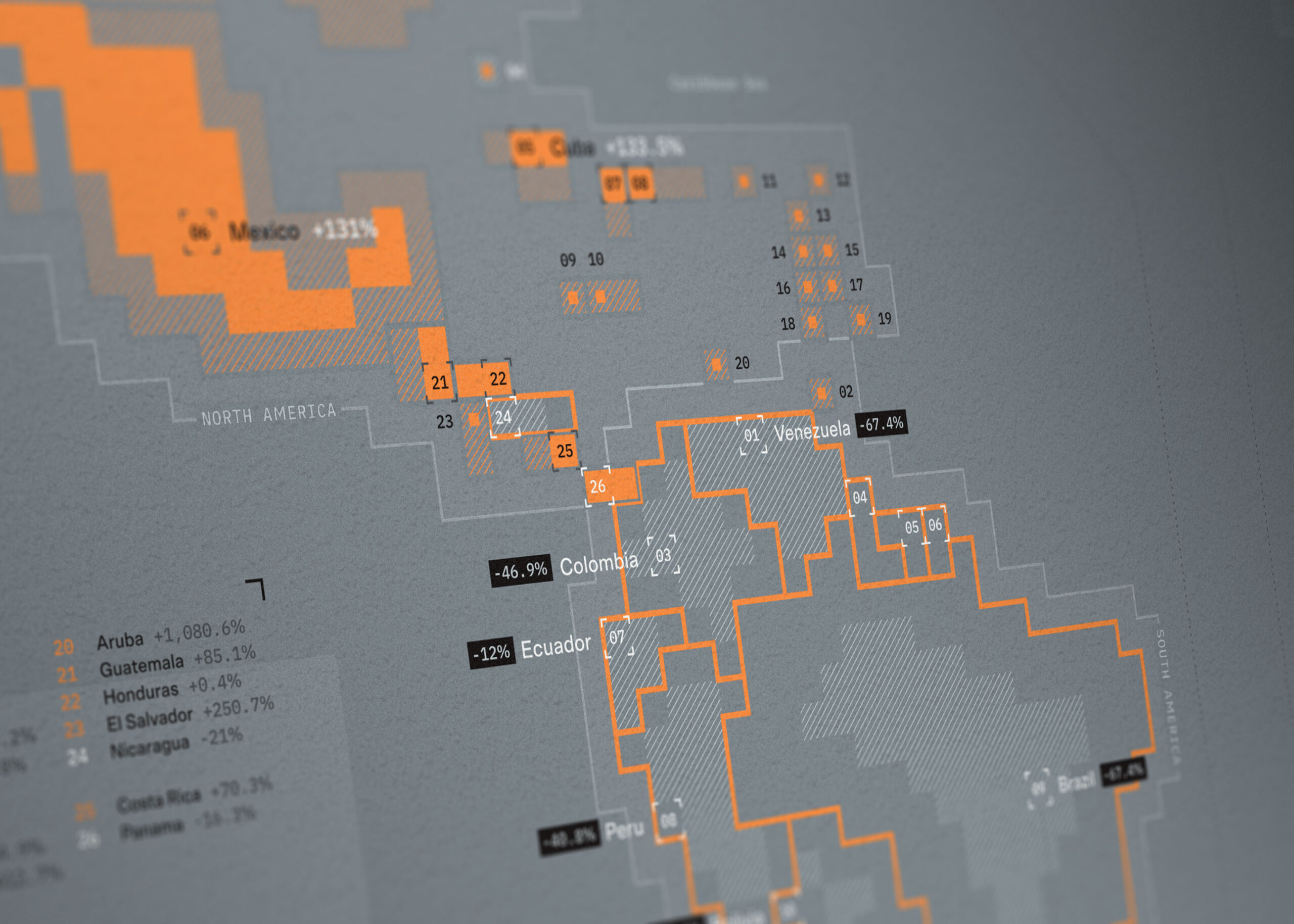
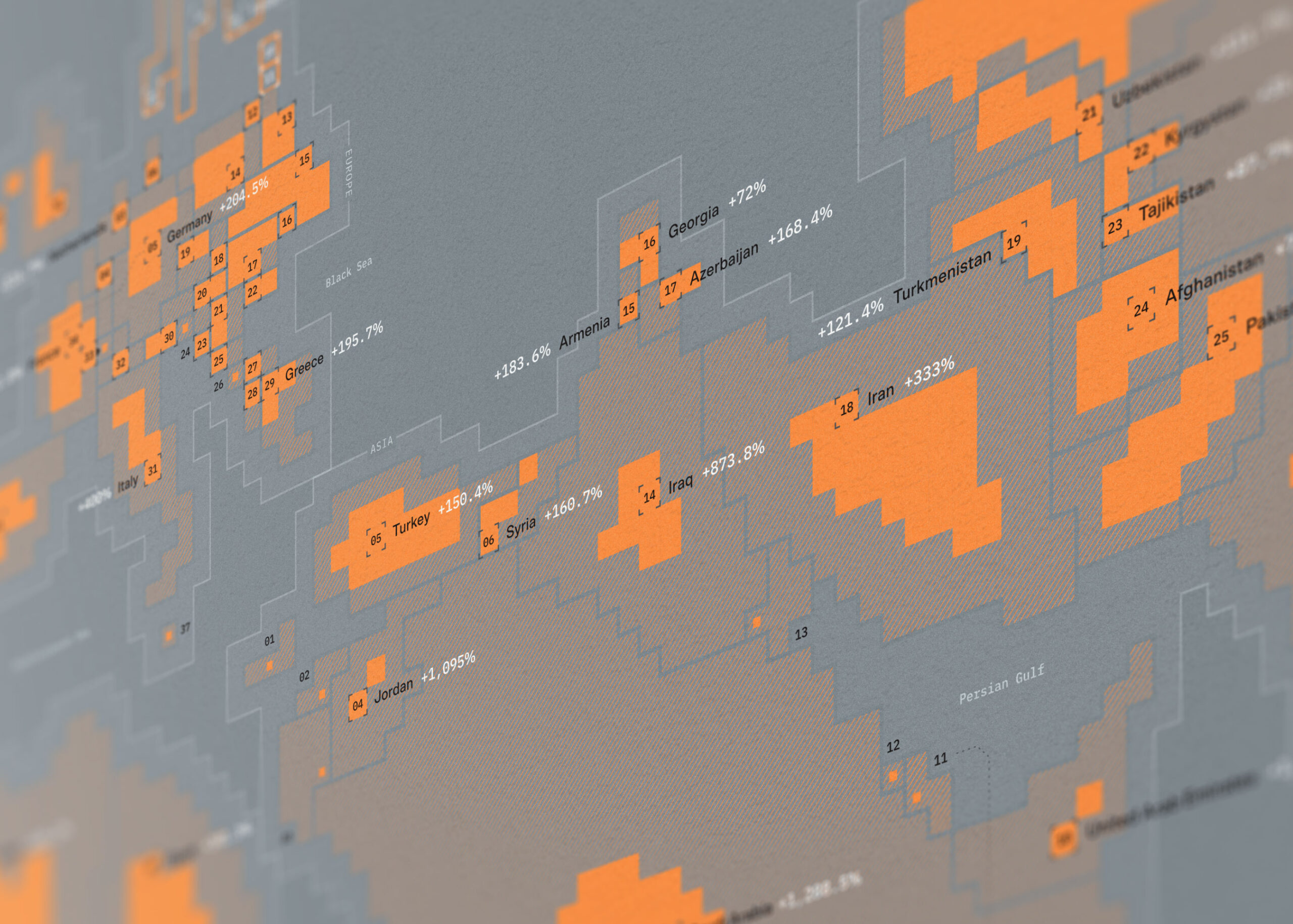
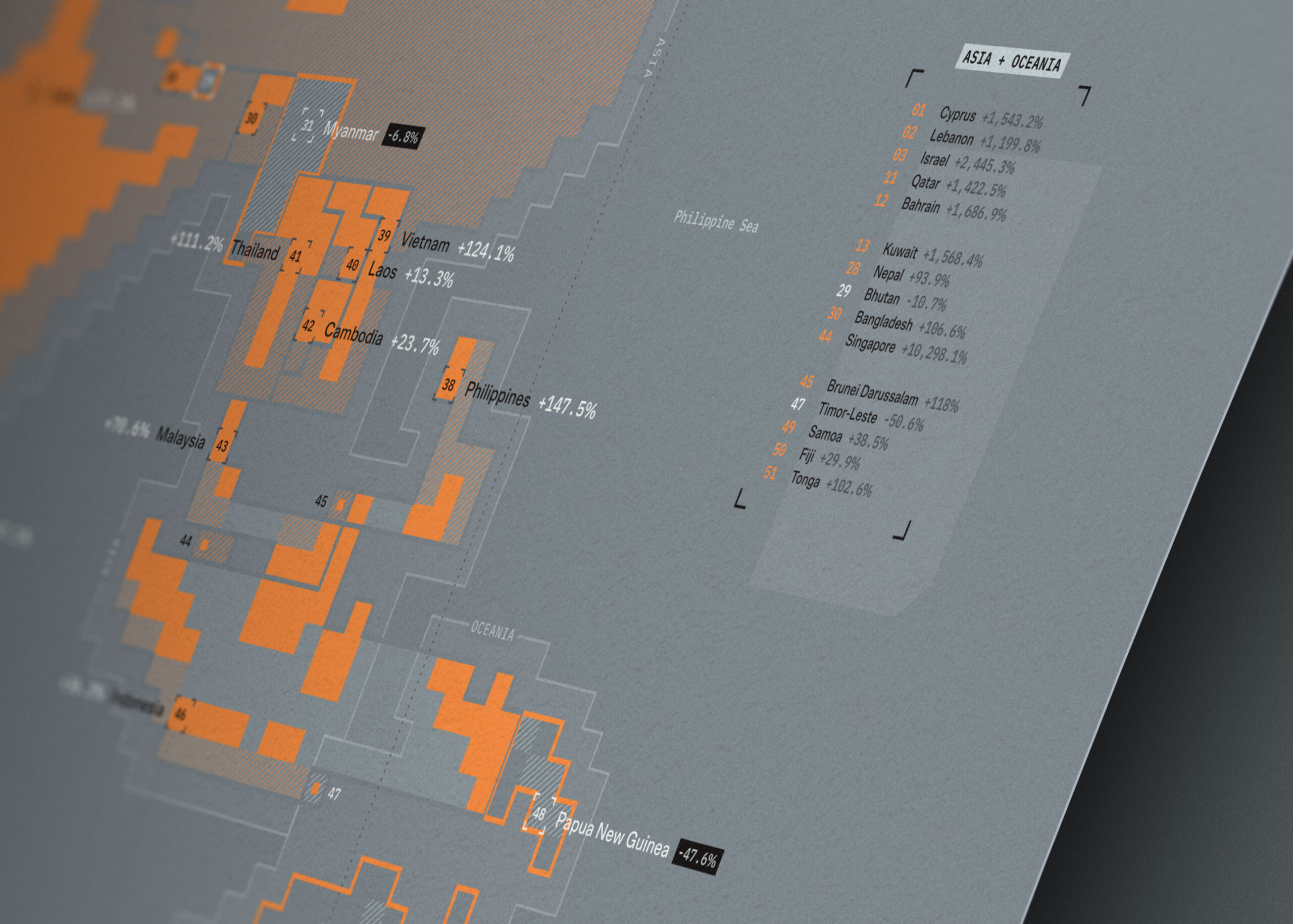
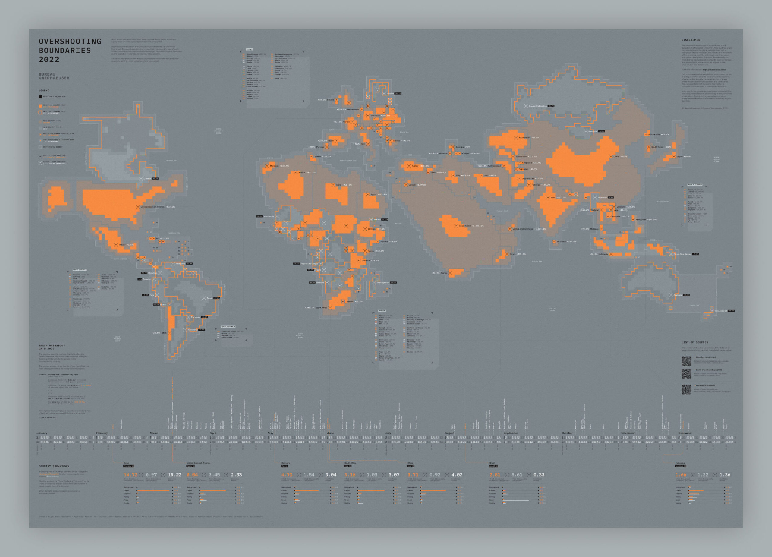
What would our world look like if each country would be big enough to supply their citizen’s consumption demand per capita? Inspired by the data from the Global Footprint Network for the World Overshoot Day, we designed a world map that visualizes the size of each country based on the consumption demand per capita (Ecological Footprint) vs. the available resources per country (Biocapacity). Countries with populations that consume more resources than available appear larger than their actual size (and vice versa).
